Alma Babycare — Conceptual Brand & Packaging Redesign
I was commissioned by a potential partner to the brand to explore a refreshed visual direction for Alma Babycare, including a reimagined logo and packaging system.
The goal was to infuse character into the brand’s look and feel while preserving its gentle, organic essence - balancing warmth, simplicity, and trustworthiness.
The goal was to infuse character into the brand’s look and feel while preserving its gentle, organic essence - balancing warmth, simplicity, and trustworthiness.
Before the concept reached completion, the collaboration was unexpectedly discontinued.
Nevertheless, this project represents a deeply considered exploration of how Alma Babycare could evolve visually, aligning the brand’s purity with a more contemporary aesthetic.
Nevertheless, this project represents a deeply considered exploration of how Alma Babycare could evolve visually, aligning the brand’s purity with a more contemporary aesthetic.
Logo Suggestions
...to get a sense of the direction the brand aims to take.
The logo shown above reflects the outcome of the client discussion following the review of the drafts below.
The logo shown above reflects the outcome of the client discussion following the review of the drafts below.


Each logo was accompanied by a tailored packaging concept to reinforce its identity.
This particular concept focuses on tactile details across both the box and tube packaging, creating subtle variations in surface reflectiveness. These changes in texture not only enrich the sensory experience but also help guide visual hierarchy - highlighting key elements where emphasis is needed. The round purple cap ties it all together, serving as a consistent and recognizable thread throughout the brand’s visual identity.
This particular concept focuses on tactile details across both the box and tube packaging, creating subtle variations in surface reflectiveness. These changes in texture not only enrich the sensory experience but also help guide visual hierarchy - highlighting key elements where emphasis is needed. The round purple cap ties it all together, serving as a consistent and recognizable thread throughout the brand’s visual identity.
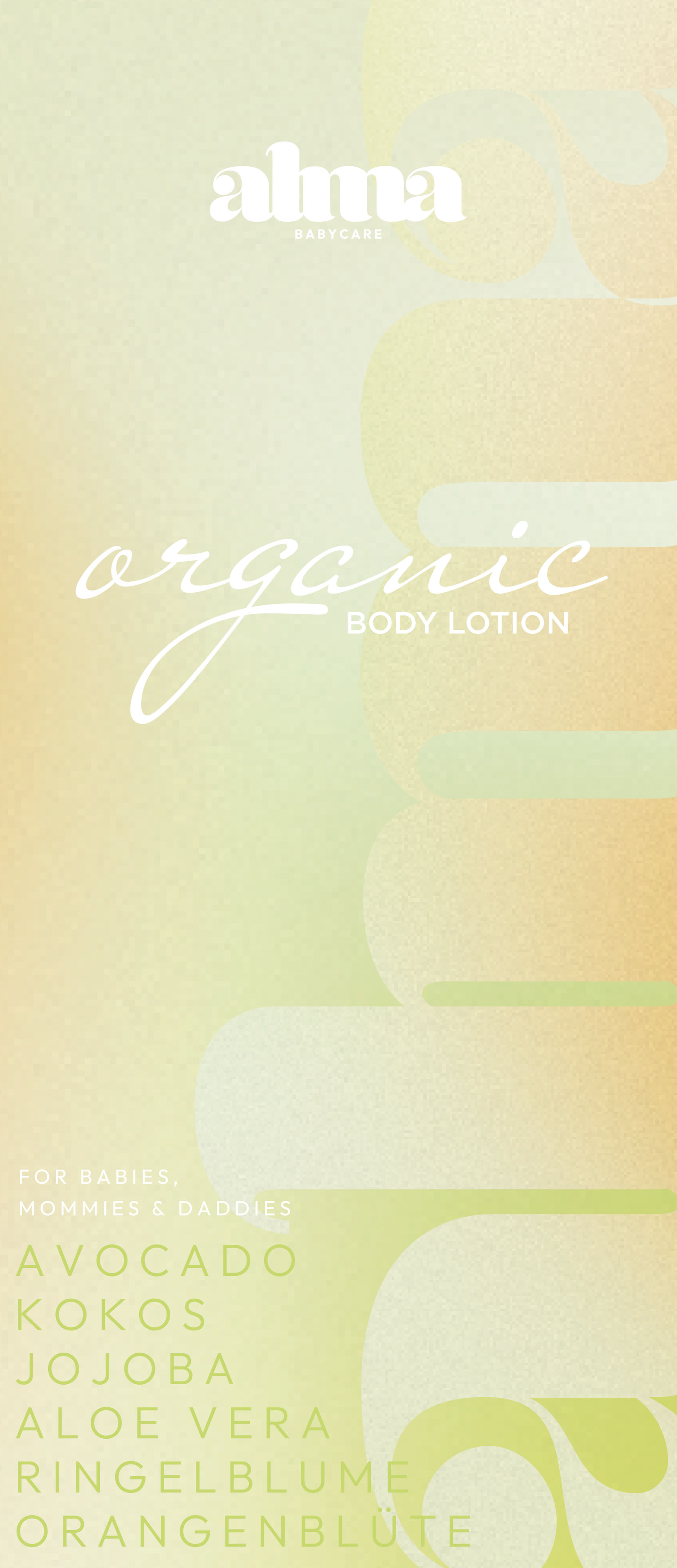
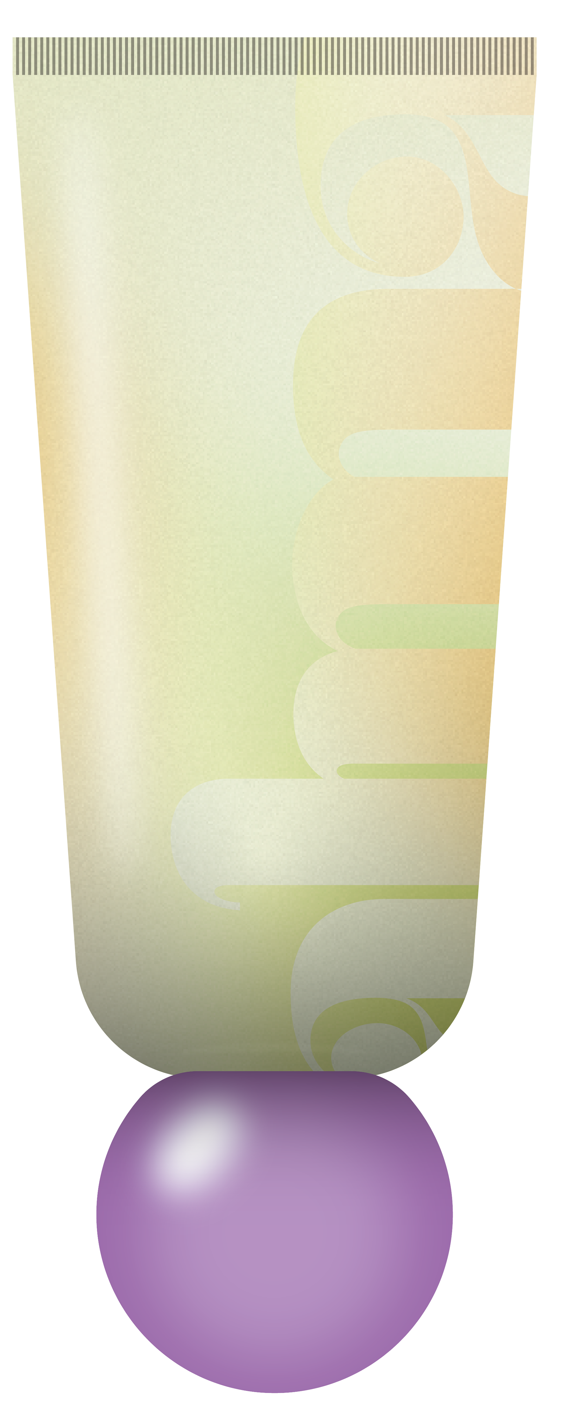
Draft for a cohesive packaging design
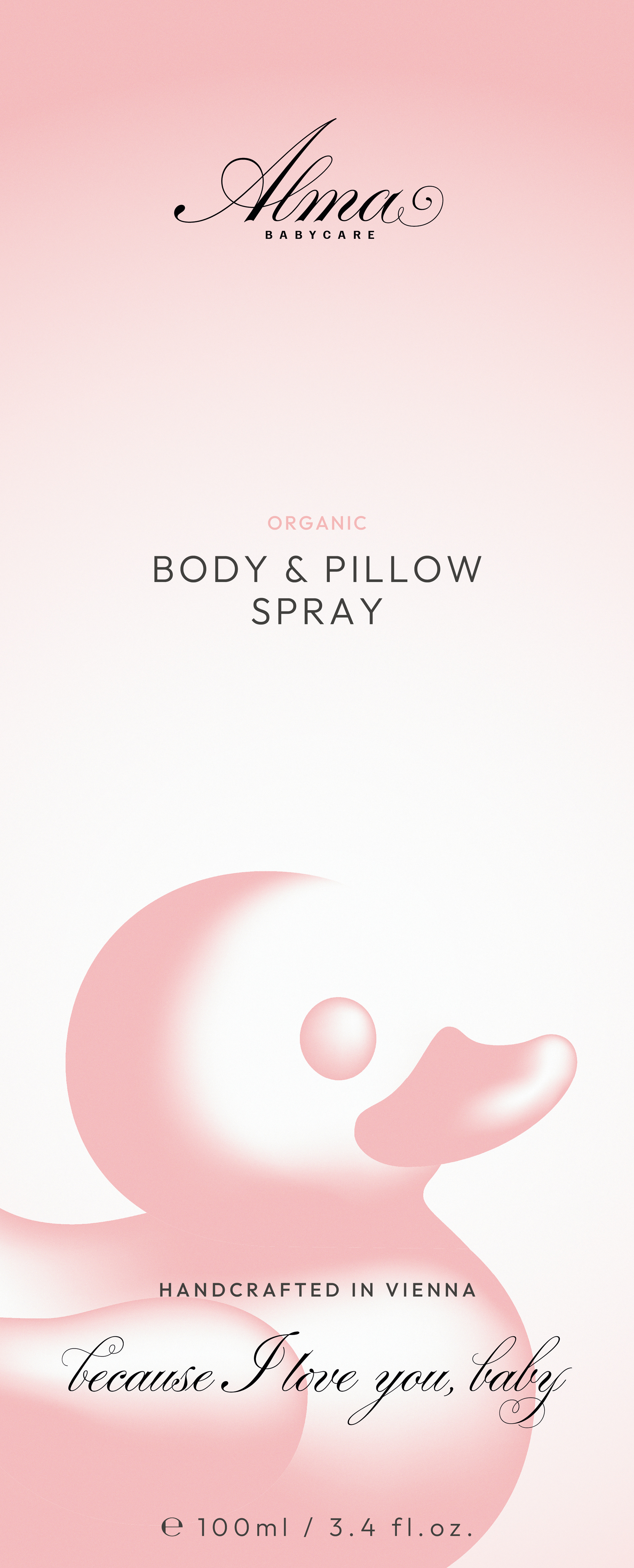
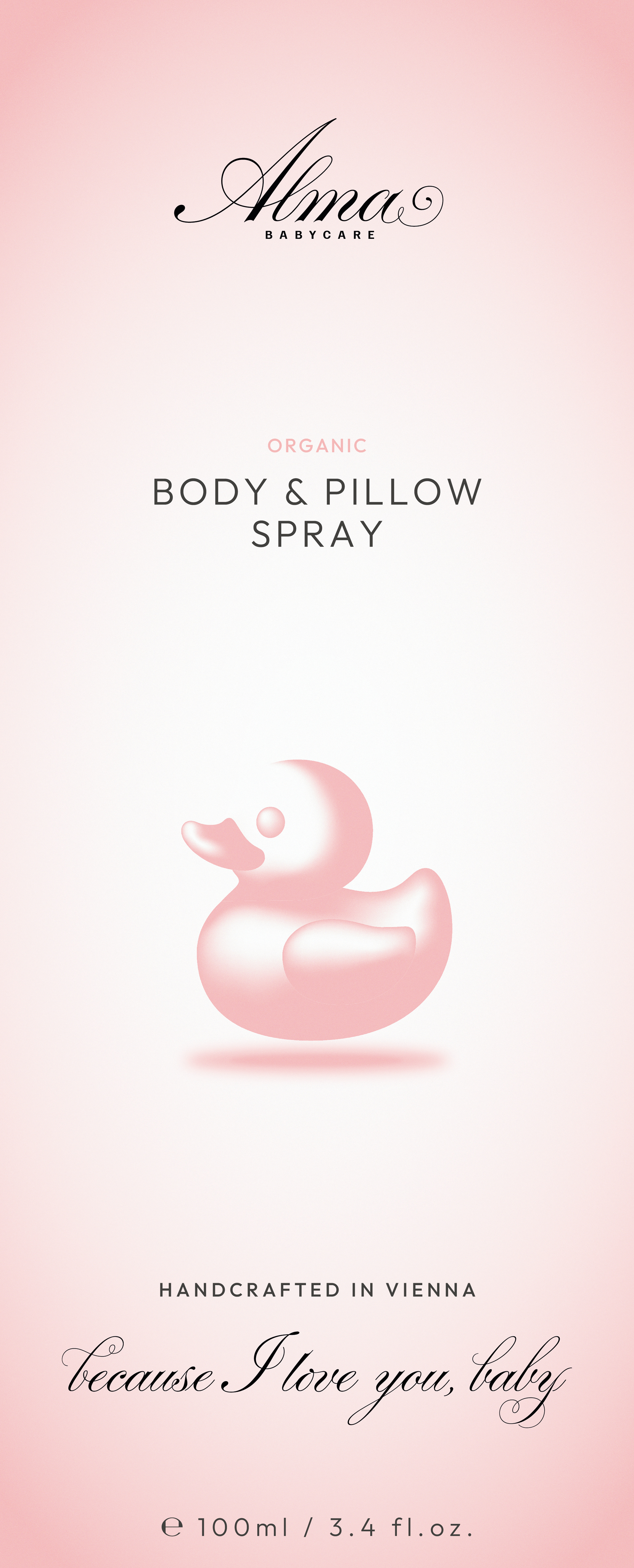
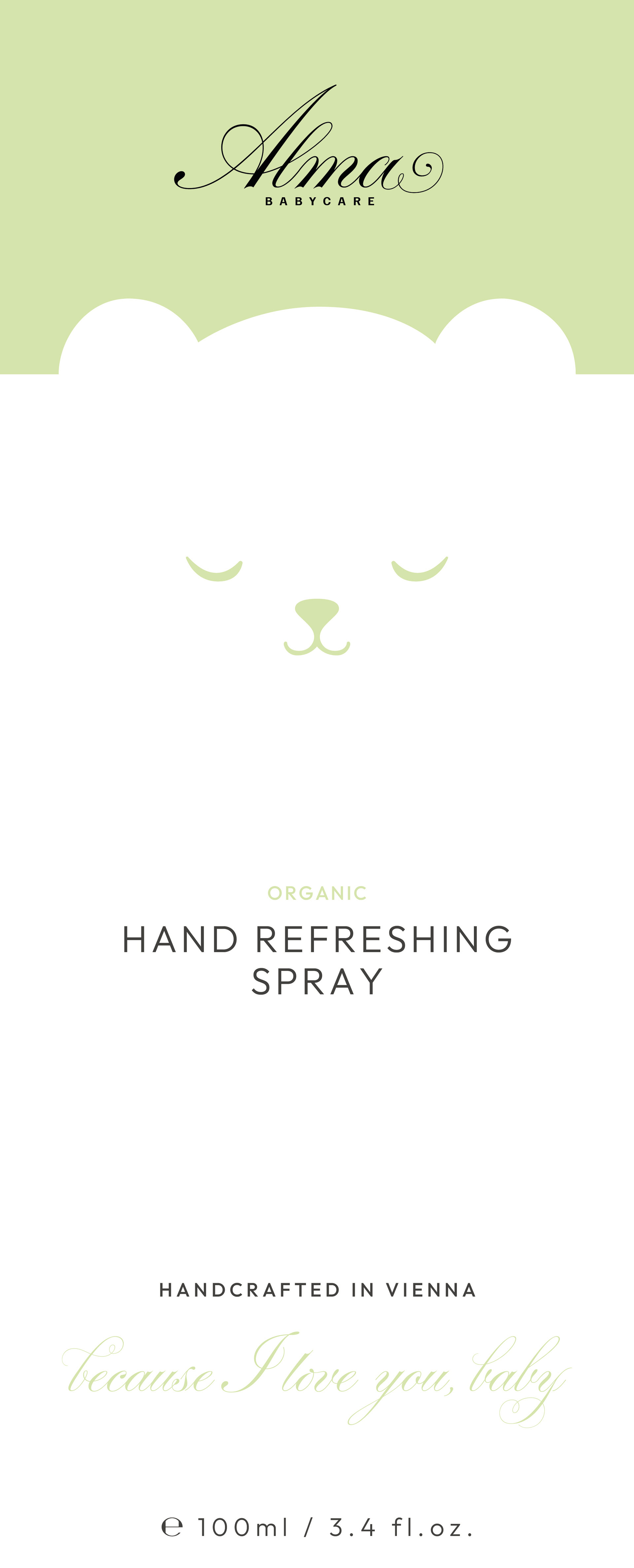
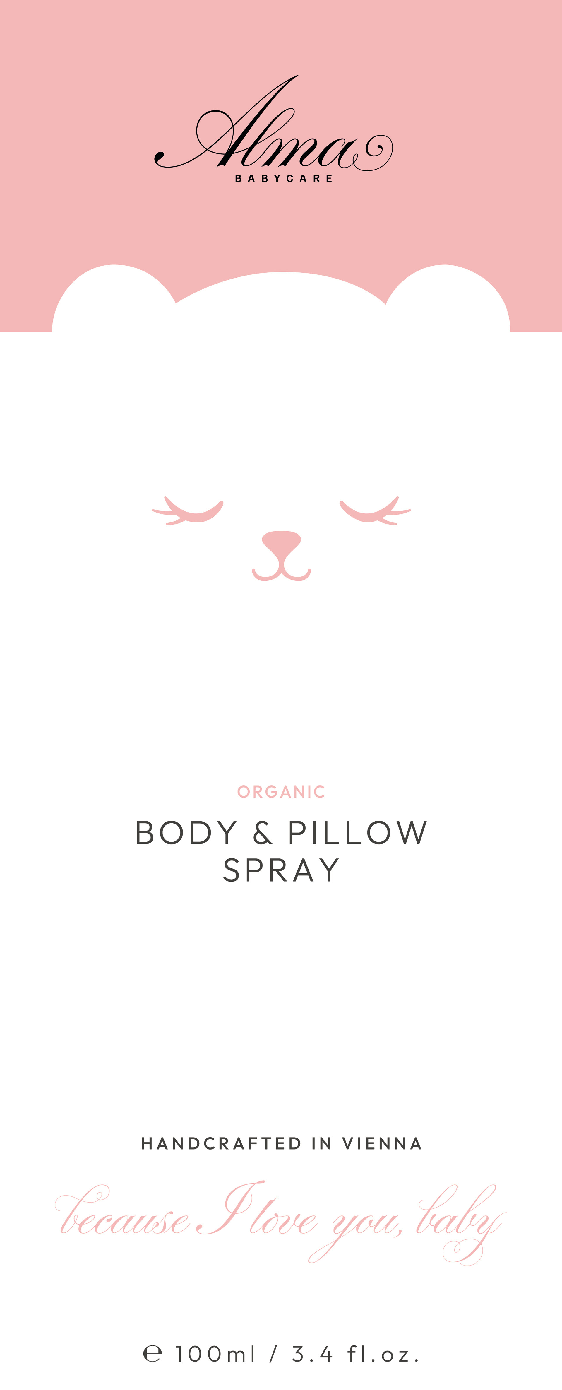
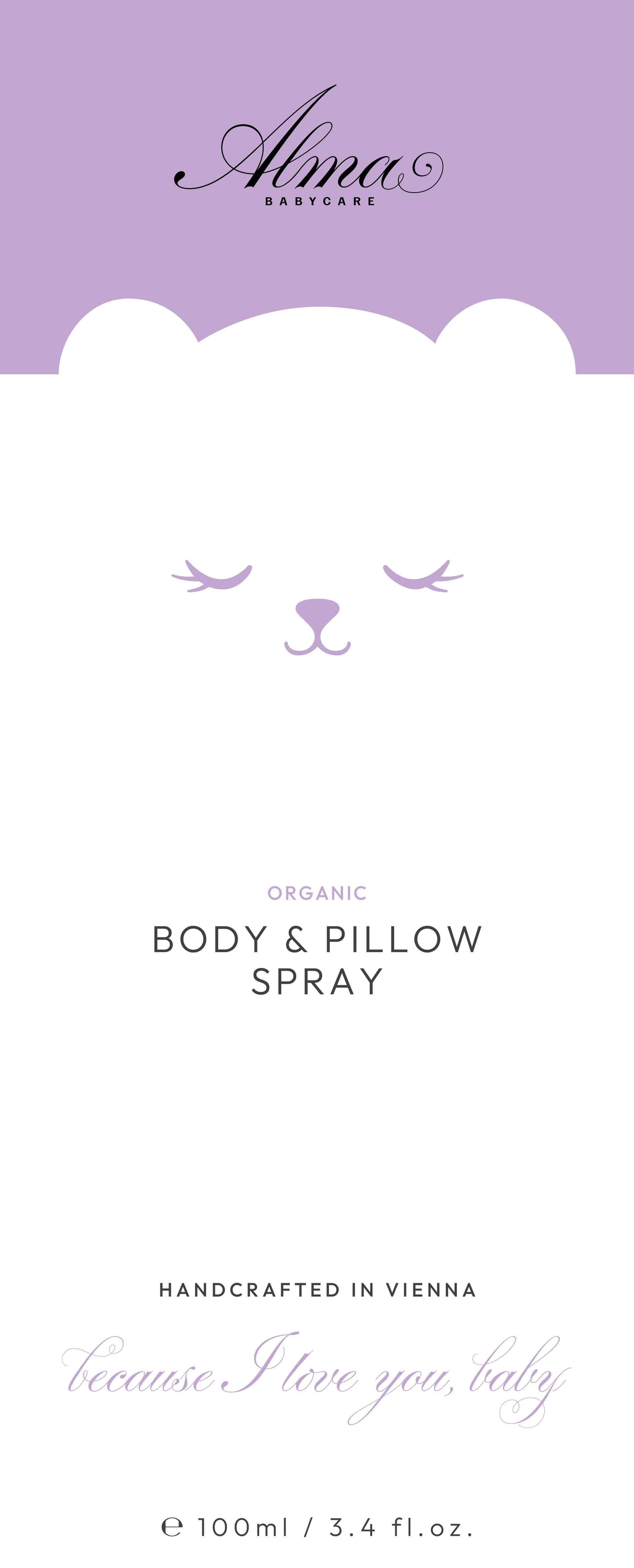
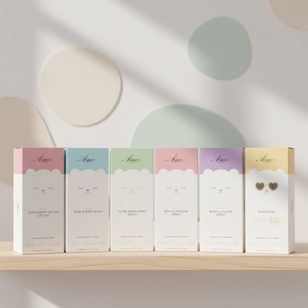
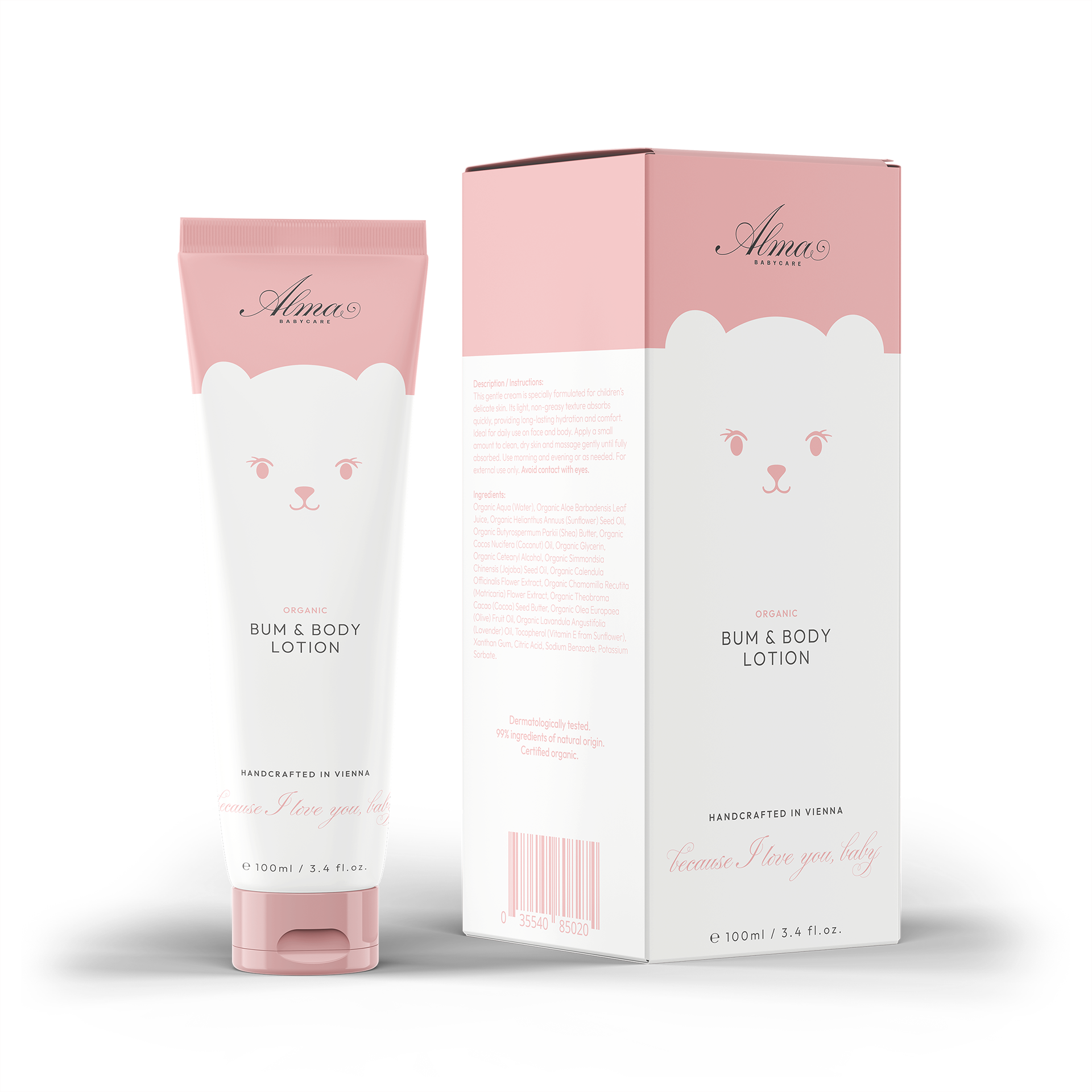
The idea of introducing a mascot was well received by the client. Each product features unique expressions and color variations to distinguish between items and create an engaging shelf presence - appealing to both parents and children alike. The goal was to craft an approachable design that balances playfulness with the refined aesthetic of French skincare packaging.
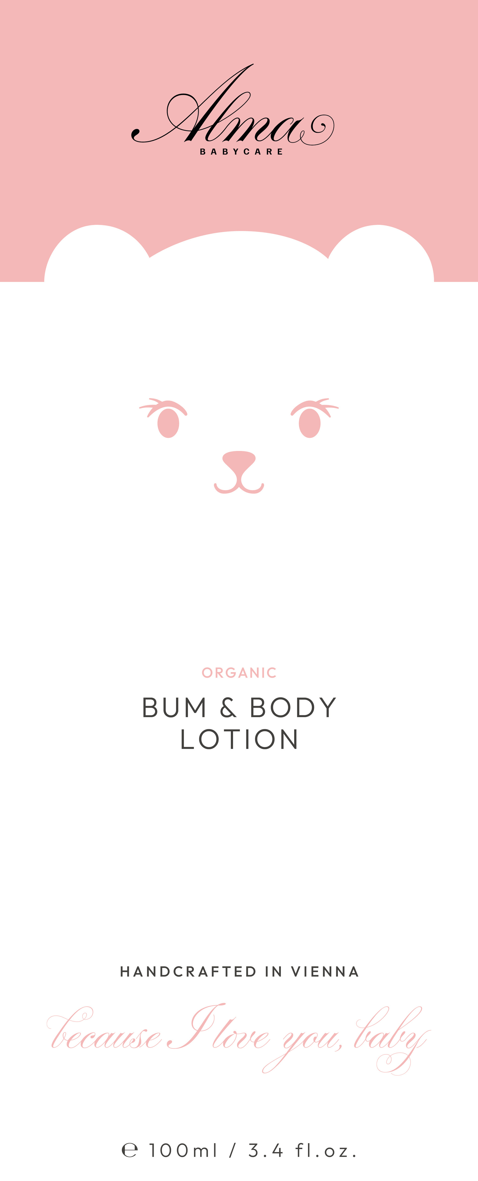
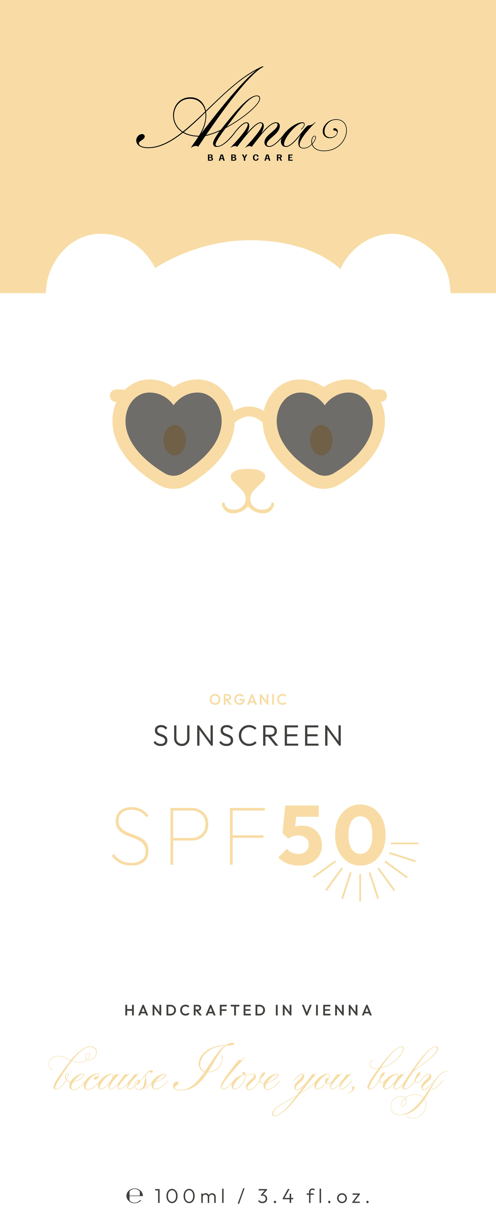
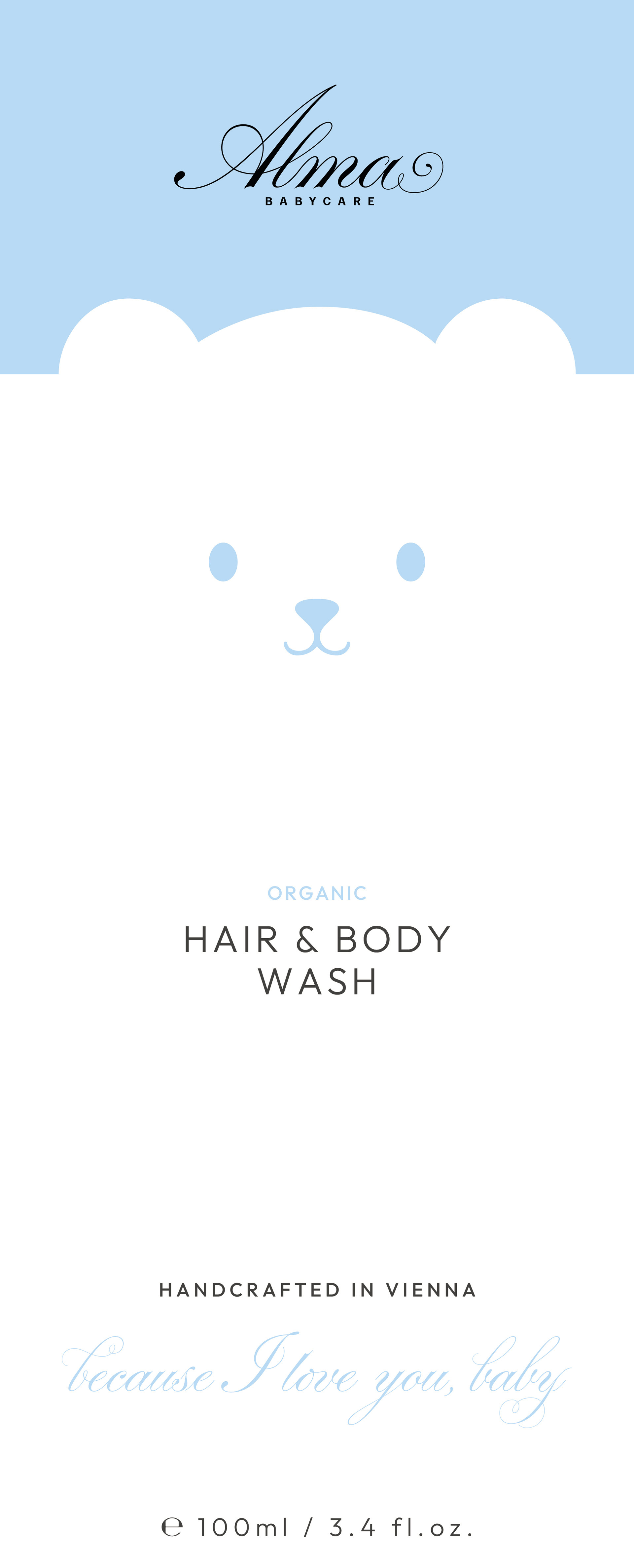
Second Draft for the new packaging
In this draft the rubber-duck poses as the mascot, creating a unique and memorable design on a soft cream-pink.