Manolt Consulting — Corporate Identity
The corporate identity for Manolt Consulting conveys a sense of solidity, security, and optimism — the core values of the brand.
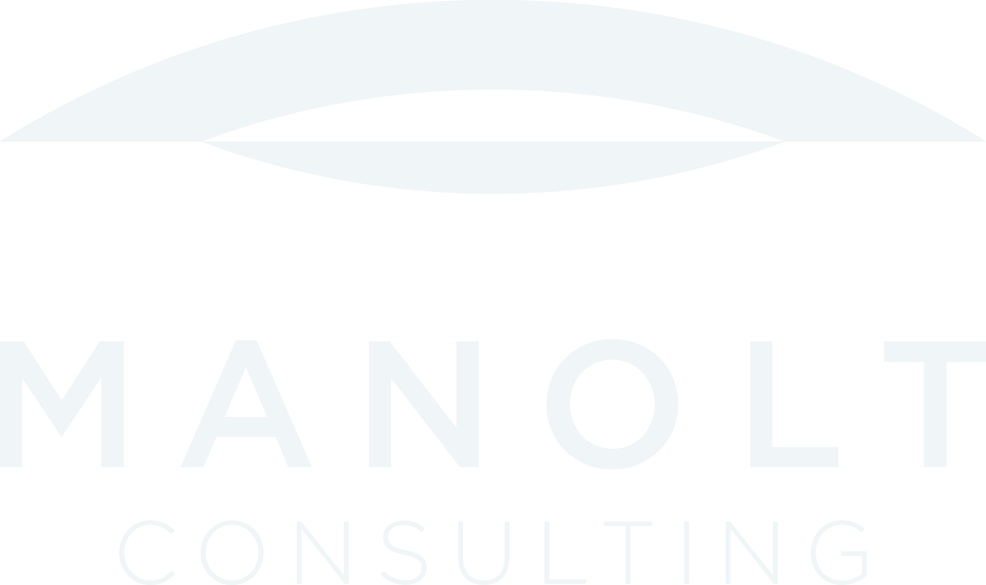
The design centers on a calm yet powerful visual language: geometric precision, a deep navy tone (Black Pearl), and the modern clarity of the Gotham typeface together communicate trust, structure, and contemporary professionalism.
The logo symbol, a stylized arc, represents stability and forward vision — a bridge between experience and progress. Its symmetry and open form evoke both confidence and transparency, qualities essential in the consulting field. Subtle contrasts of Anti-Flash White and Black Pearl enhance readability and refinement, while the pattern system adds flexibility across applications, from print to digital to branded materials.
The resulting identity positions Manolt Consulting as a reliable and future-oriented partner, combining strategic clarity with a sense of optimism and composure.