Alma Babycare — Conceptual Brand & Packaging Redesign
Alma Babycare is an established Austrian babycare brand. A potential partner approached me to explore what a refreshed visual identity could look like — a reimagined logo and a cohesive packaging system that would give the brand more character and shelf presence, without losing the gentle, organic quality it was already known for.
The challenge was finding the right balance: warm and approachable enough for parents, engaging enough for children, and refined enough to sit comfortably within the premium babycare space.
Multiple logo directions were developed and reviewed with the client, each accompanied by its own tailored packaging concept so the visual logic of each direction could be evaluated as a whole rather than in isolation.
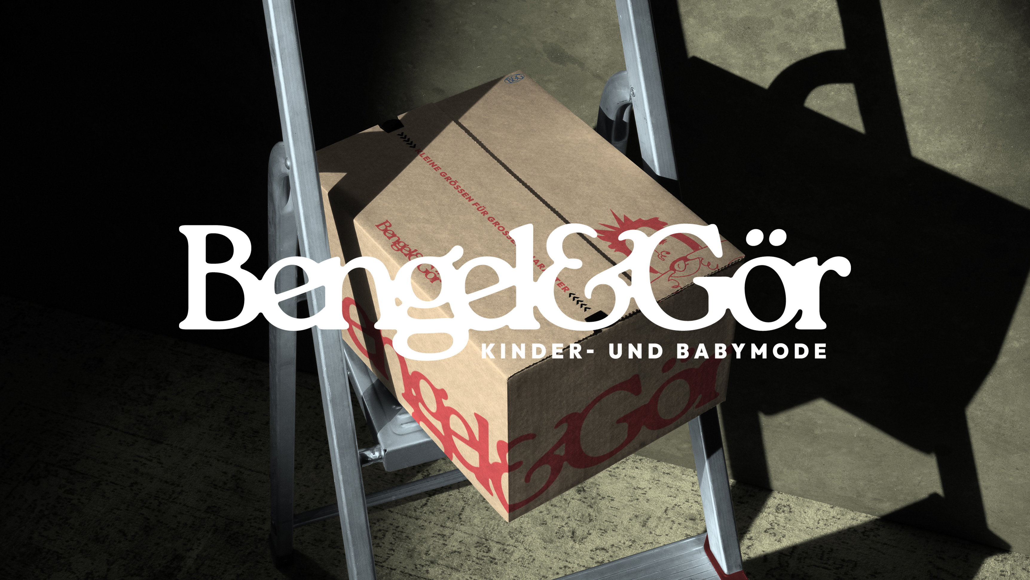
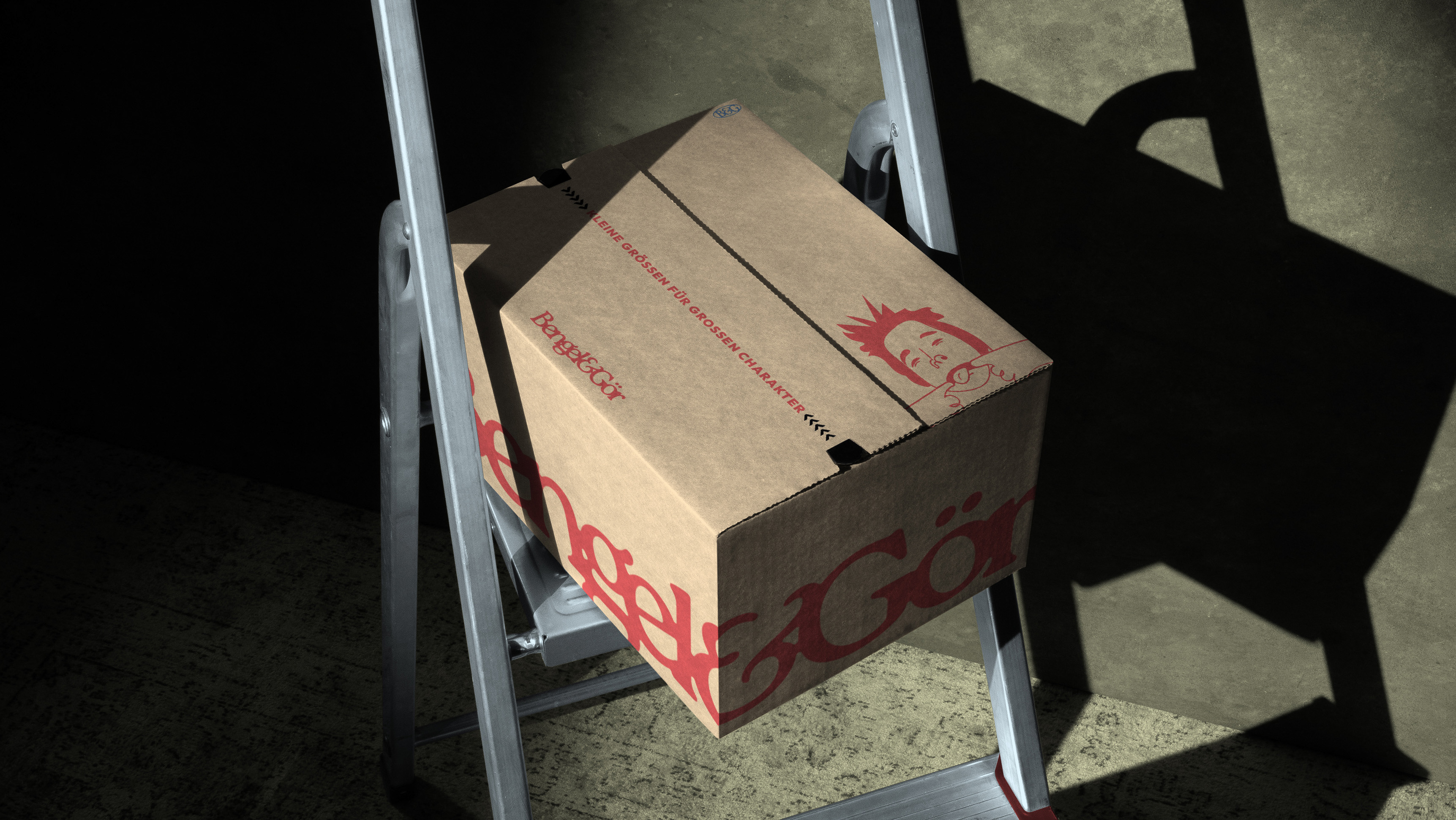
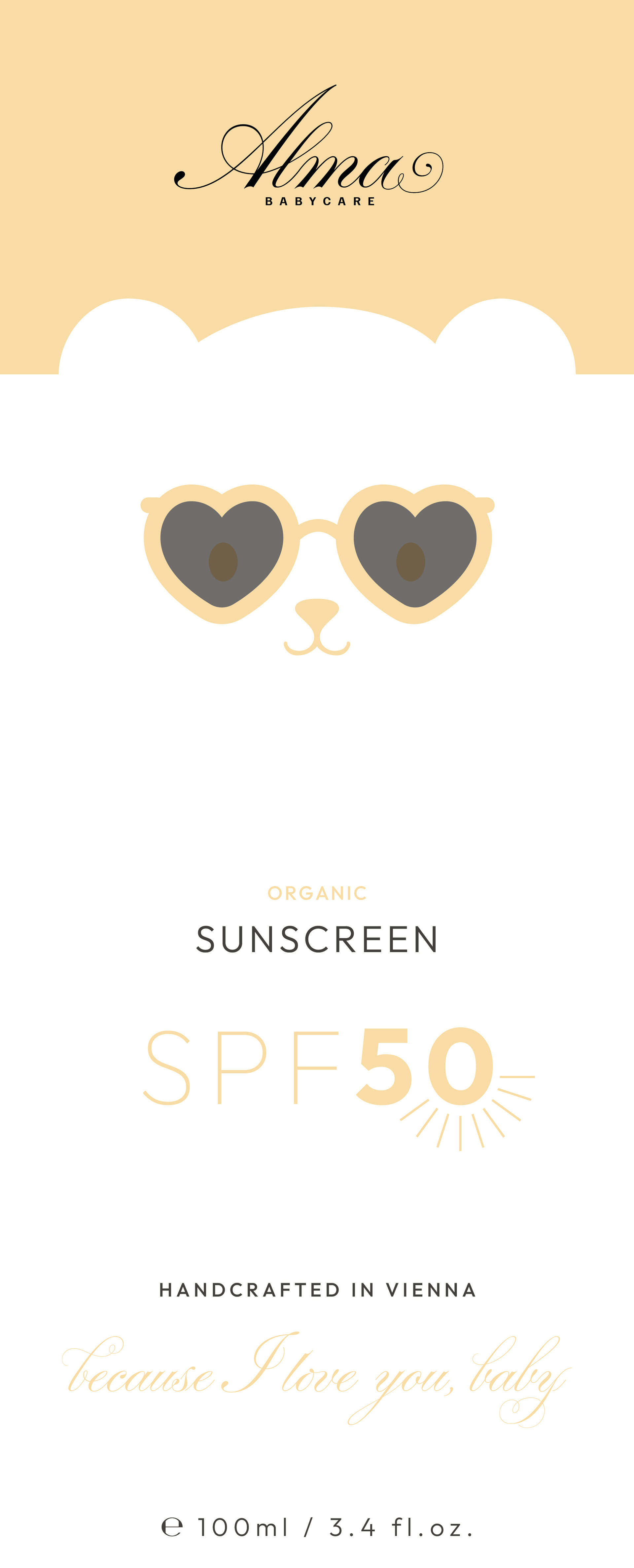
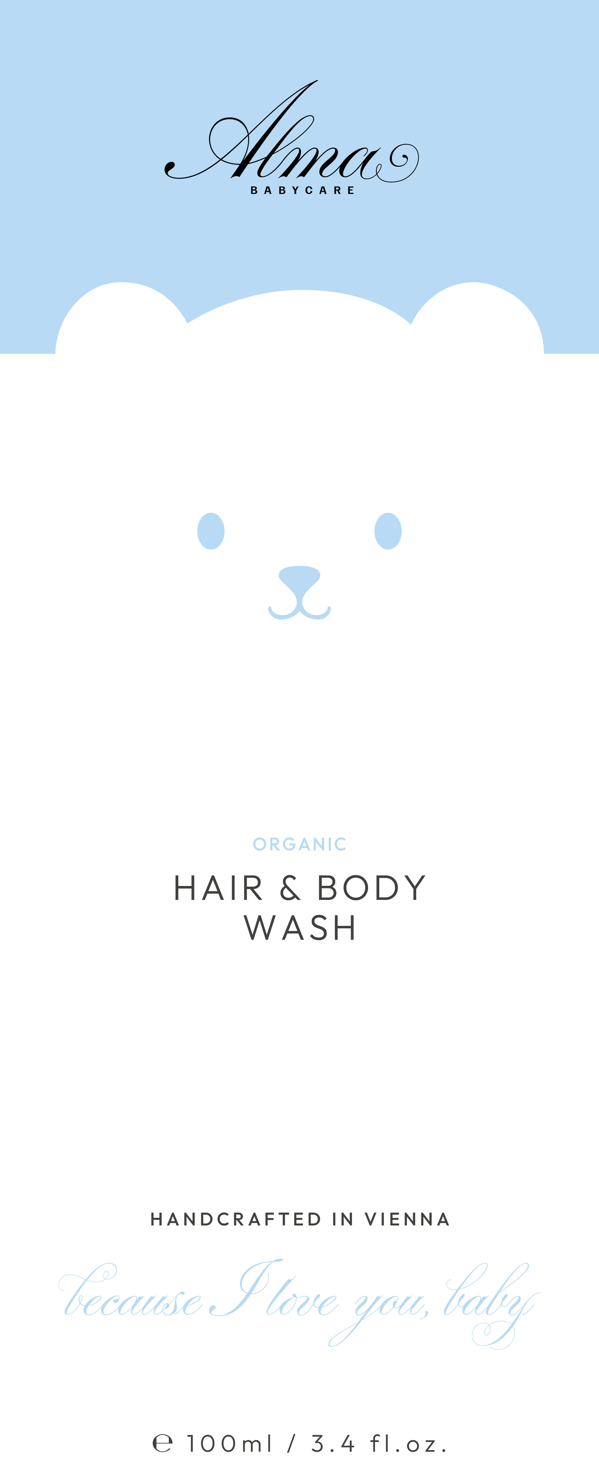
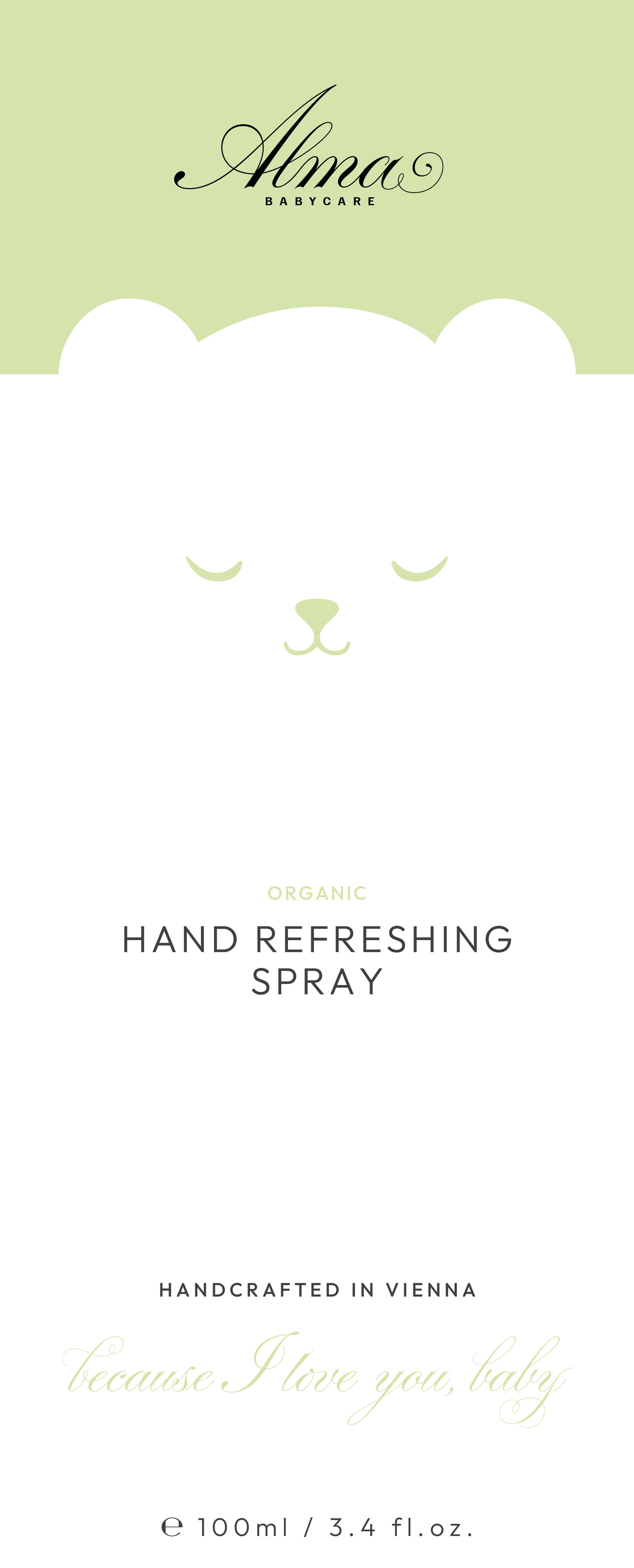
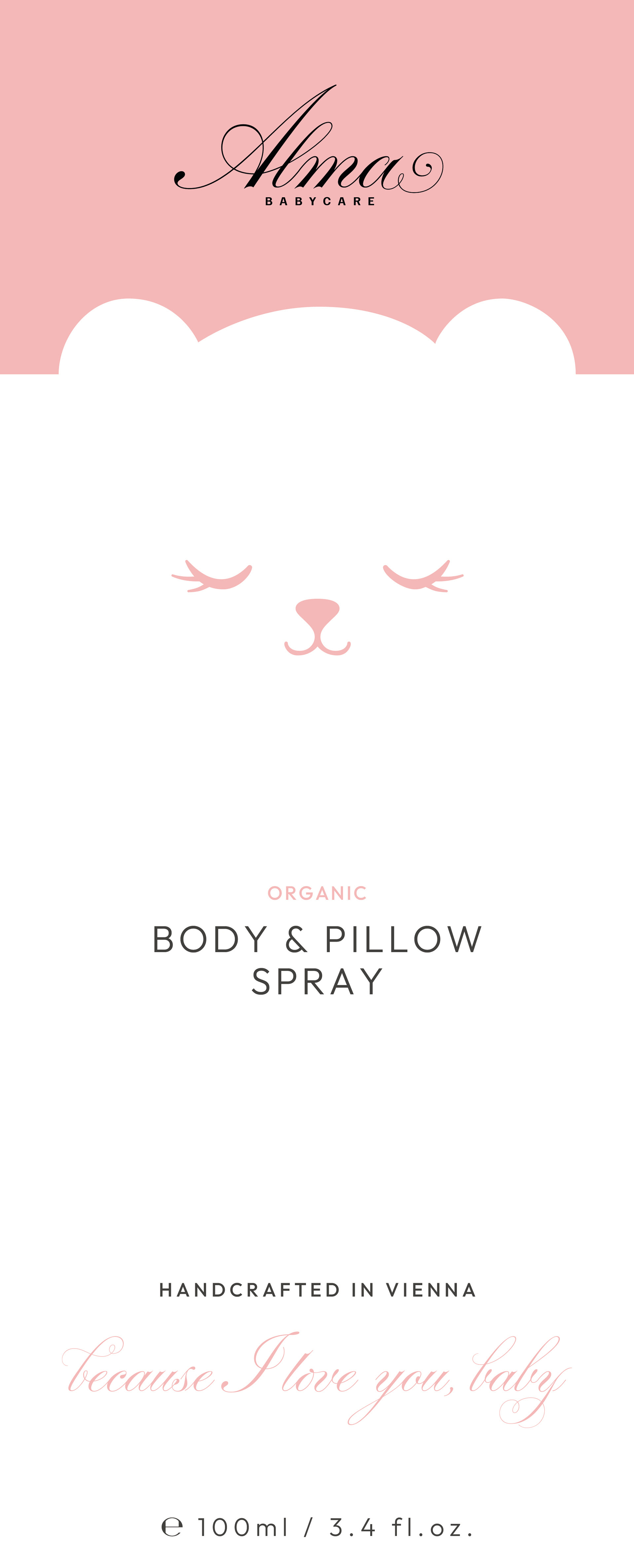
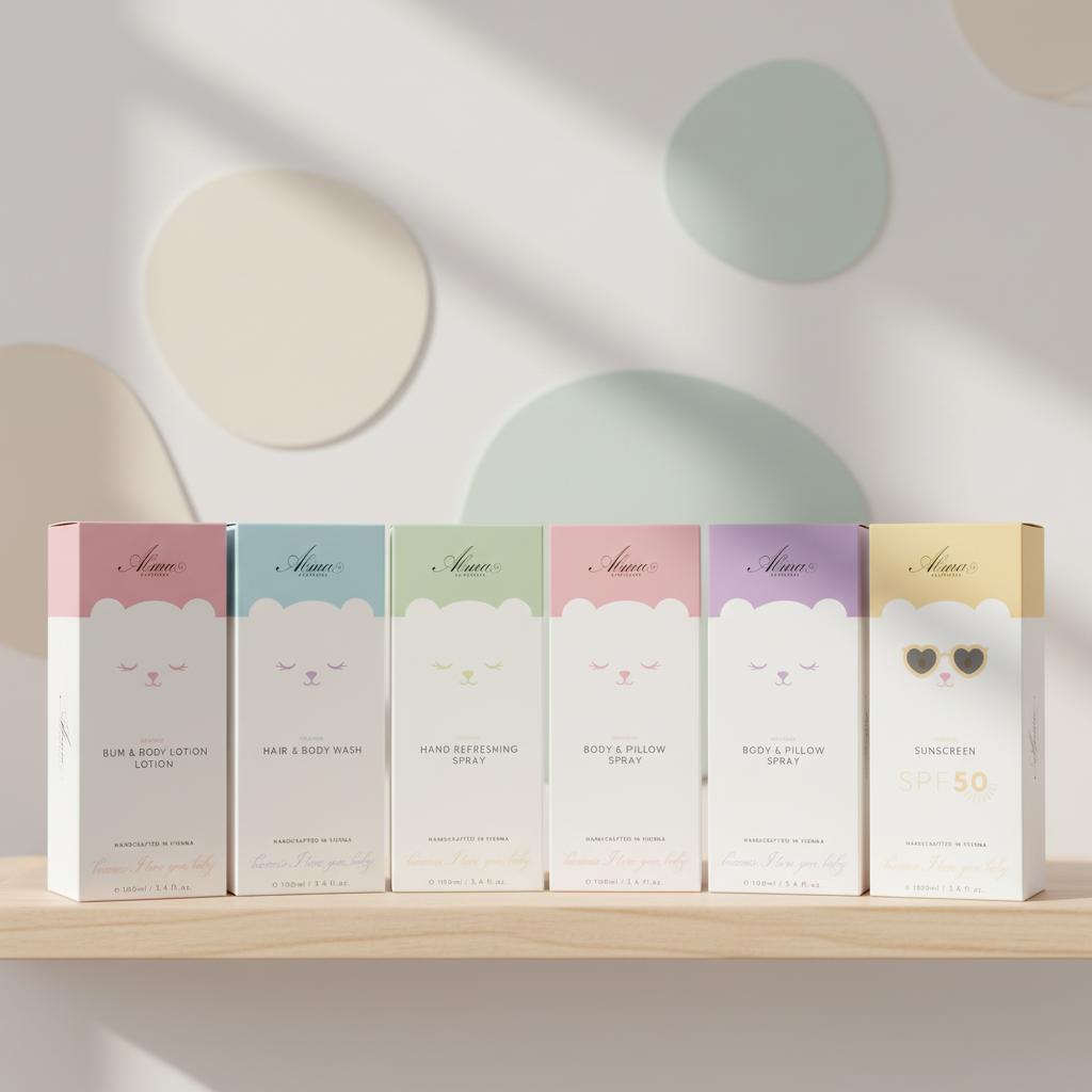
Two mascot-led packaging concepts were developed in parallel. The first introduced a character with unique expressions and colour variations across different products, making it easy to distinguish items on shelf while creating a sense of personality within the range. The second explored a rubber duck as mascot, rendered on a soft cream-pink ground — simpler, more iconic, and immediately memorable.
The partnership was discontinued before the concept reached completion, and the redesign was never implemented. What remains is a thorough exploration of how an established babycare brand can evolve visually: gaining personality and contemporary appeal while staying true to what made it trustworthy in the first place.
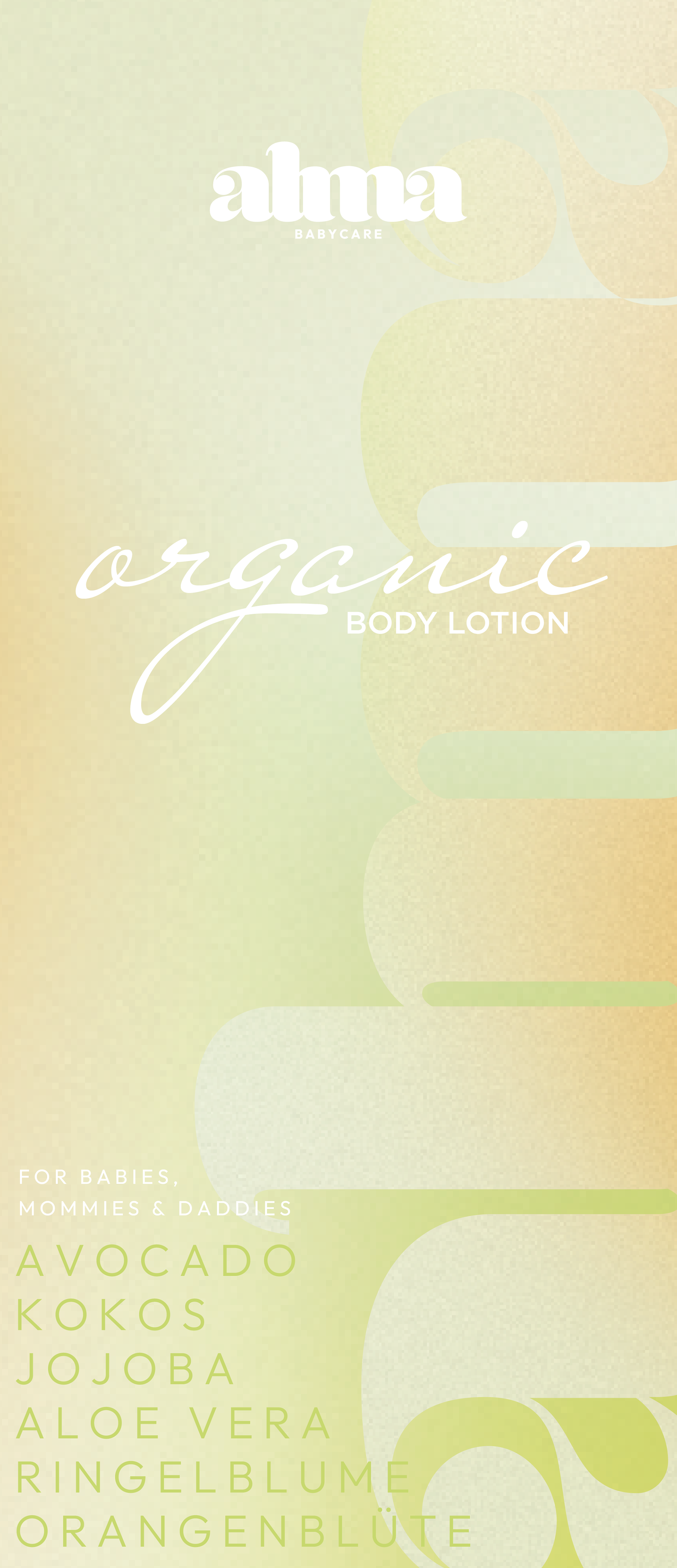
Logo Explorations
Several directions were developed at the start of the process, each proposing a different take on the brand's character — from softer, more organic approaches to cleaner, more contemporary solutions. The explorations below show the range of ideas brought to the initial review, with the direction shown above emerging as the agreed starting point for further development.


Each logo was accompanied by a tailored packaging concept to reinforce its identity.
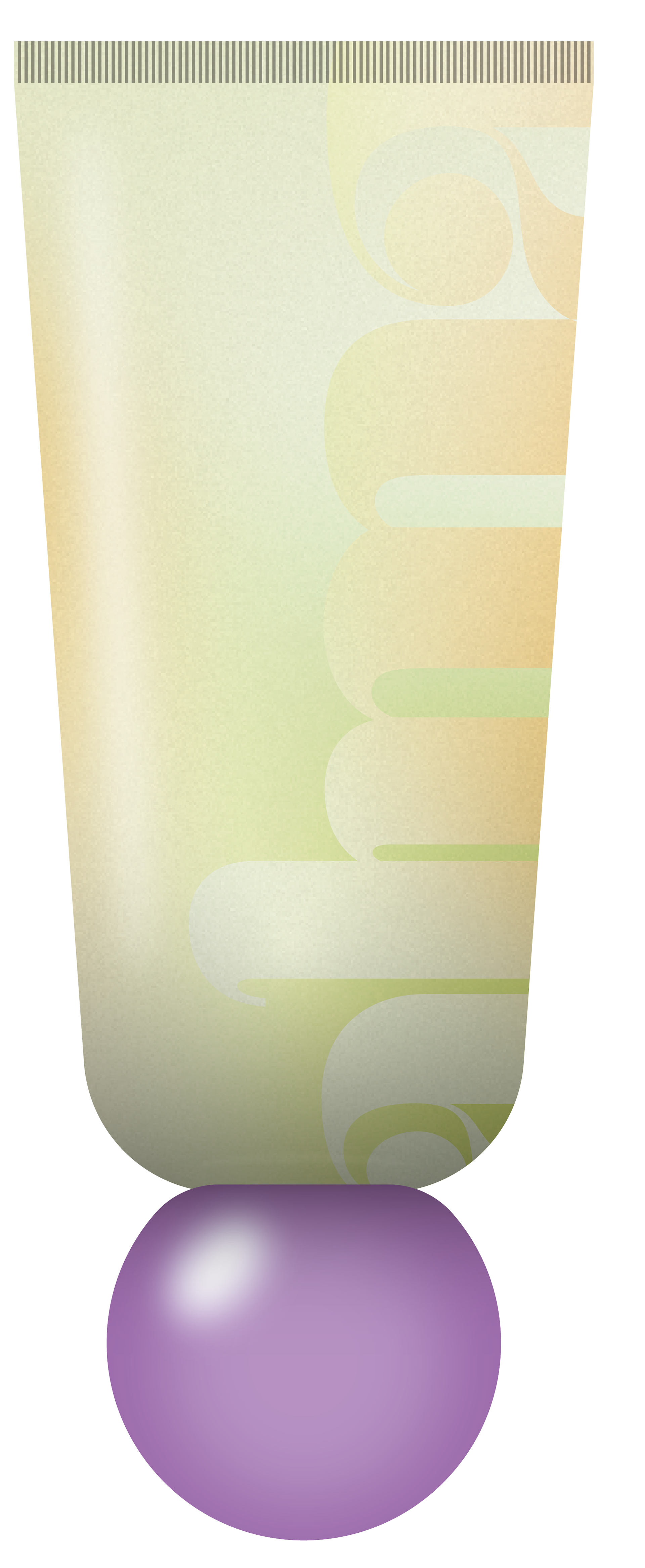
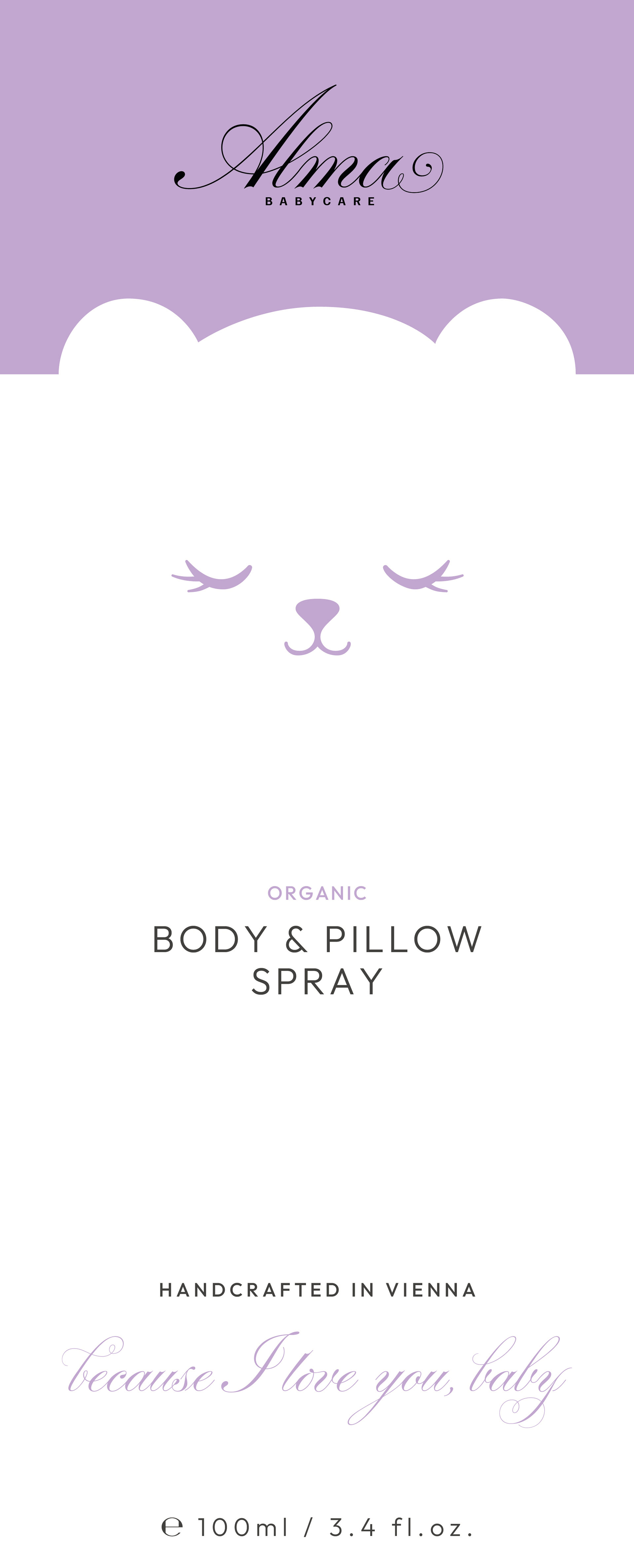
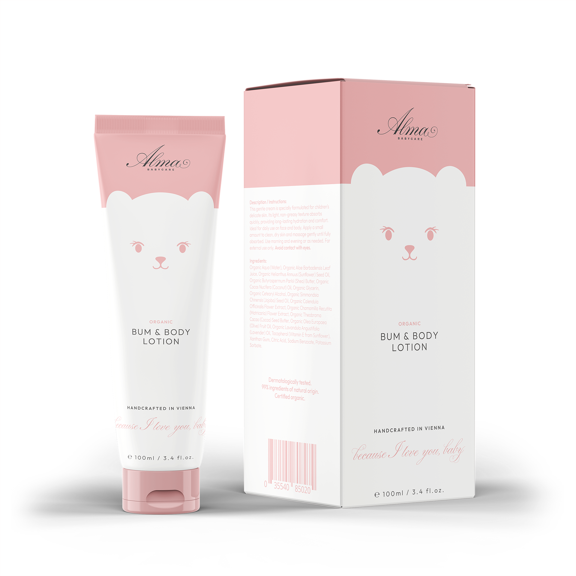
This particular concept focuses on tactile details across both the box and tube packaging, creating subtle variations in surface reflectiveness. These changes in texture not only enrich the sensory experience but also help guide visual hierarchy highlighting key elements where emphasis is needed. The round purple cap ties it all together, serving as a consistent and recognizable thread throughout the brand’s visual identity.
This particular concept focuses on tactile details across both the box and tube packaging, creating subtle variations in surface reflectiveness. These changes in texture not only enrich the sensory experience but also help guide visual hierarchy highlighting key elements where emphasis is needed. The round purple cap ties it all together, serving as a consistent and recognizable thread throughout the brand’s visual identity.
Draft for a cohesive packaging design
The idea of introducing a mascot was well received by the client. Each product features unique expressions and color variations to distinguish between items and create an engaging shelf presence - appealing to both parents and children alike. The goal was to craft an approachable design that balances playfulness with the refined aesthetic of French skincare packaging.
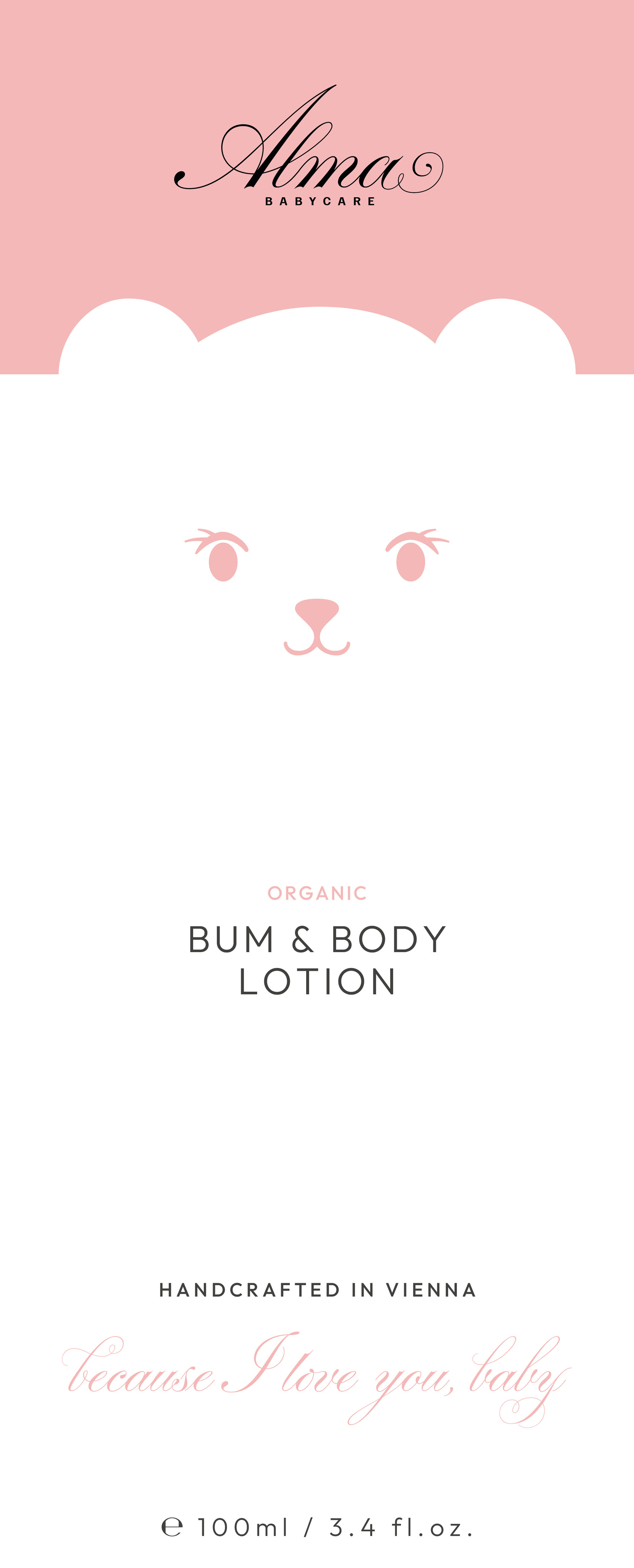
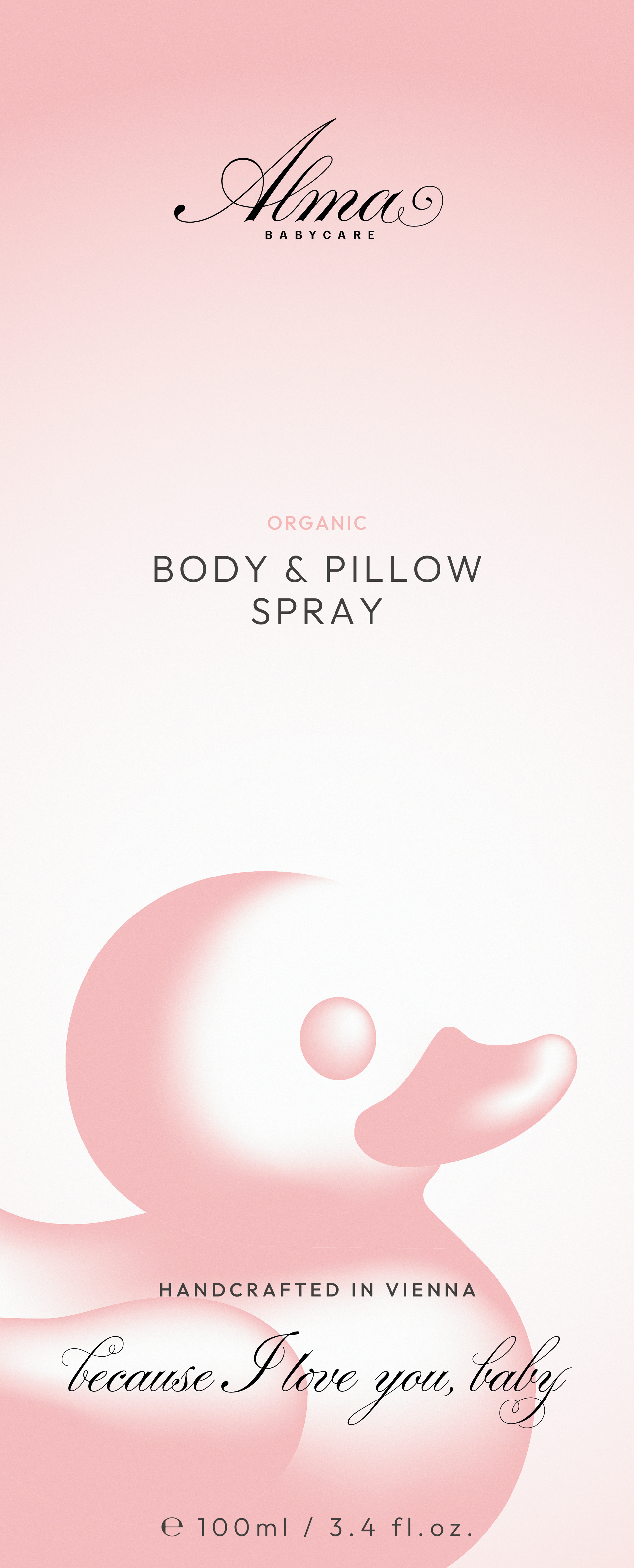
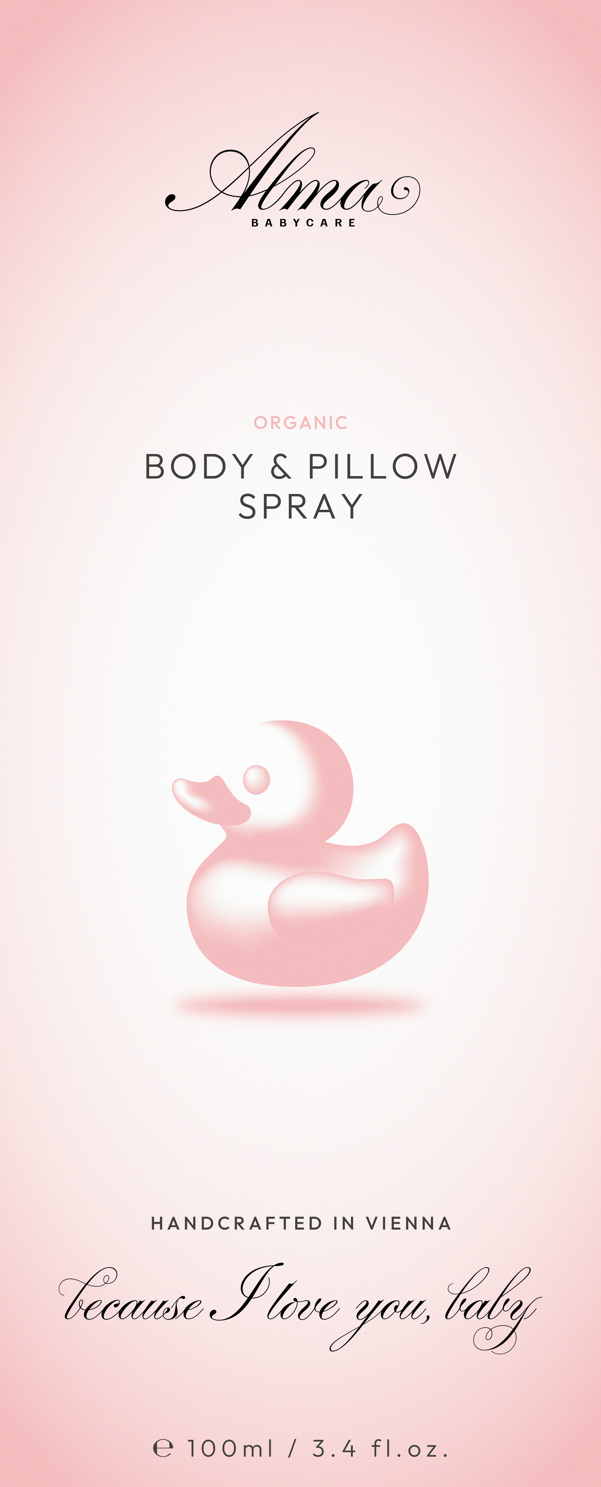
Second Draft for the new mascot-packaging
In this draft the rubber-duck poses as the mascot, creating a unique and memorable design on a soft cream-pink.